 Chanticleer Farms
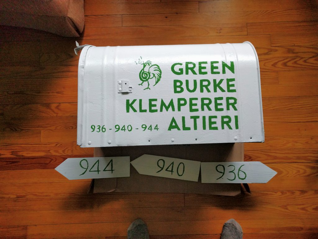
The old mailbox was in dire need of some love and attention. Though we found the same ‘rural galvanized jumbo mailbox‘ on amazon for $32.09, including shipping (you can’t survive in the country without Amazon Prime), we decided to keep our old one and just repaint it – too much stored up mojo.

As evidenced by the signature on the bottom, the original was installed by someone with the initials “B.G.” in 1973.

How the old box looked after removing the loose paint chips. Looks like some hippies had painted it.
About the typography
Brandon Grotesque is what I consider to be a very current (created in 2010), visually softer ripoff of one of the all-time classic fonts, Futura (created in 1927). It works well for poster-sized applications in all caps, and comes off as very clean. I used the bold variation for the main lettering, and projected it onto the box to pencil in the lettering for hand painting. We went with “John Deere Green,” since that was the only green they had at the tractor store where we happened to be shopping and, well, it is a farm.

Sample of Brandon Grotesque Bold

The mailbox in its current form. Memorize how it looks, in case you show up and think you’ve gone to a design convention accidentally.